Day 5 - Using the Data You've Queried
In
Day 4 of the Aspen 21 Day Challenge we learned about queries and how to create them to ask questions about your data. Once you've located the data, and answered your questions there are some simple tools that you can use within Aspen. One of my favorite tools in Aspen is the Quick Chart tool. The quick chart tool allows you to create a quick graph of the data you've collected from your query. Illustration 1 displays how to start the process.
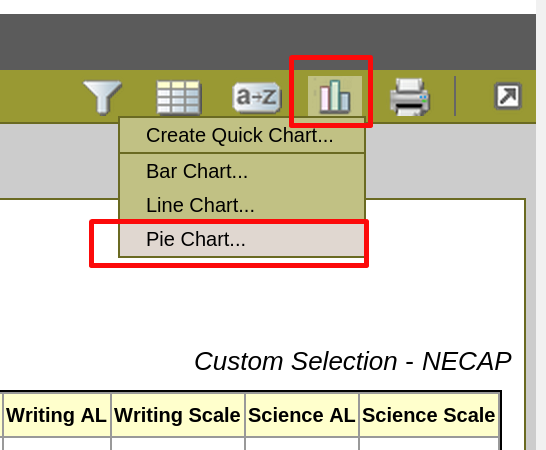 |
| Illustration 1: Create Quick Chart |
Once you've selected the type of chart you want to create you will need to determine which field you want to use to display in your graph. You can also name the chart title that will be displayed. Illustration 2 shows an example of what can be done to display the NECAP reading achievement levels in a pie chart.
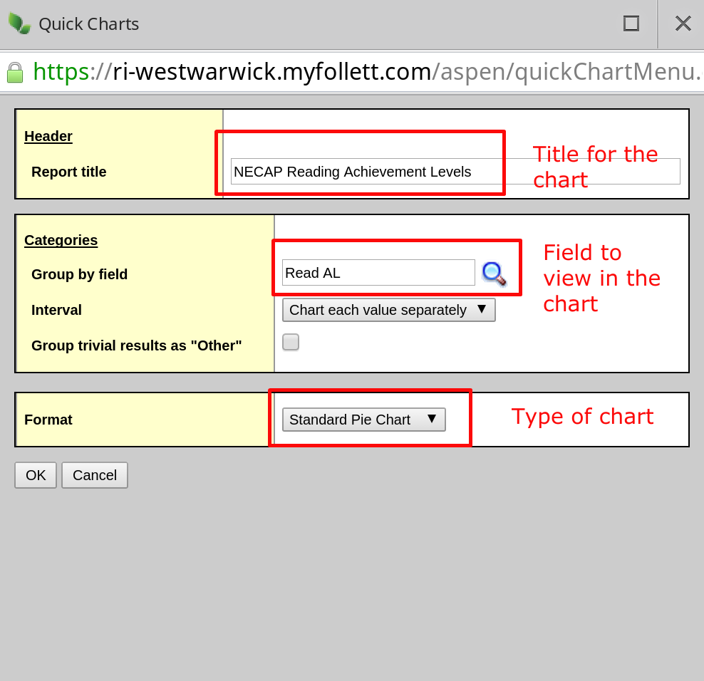 |
| Illustration 2: NECAP Pie Chart |
The pie chart created will be made available as a PDF document that can be saved to print, or shared with others. Illustration 3 is an example of the Reading NECAP data for the 2013-14 school year.
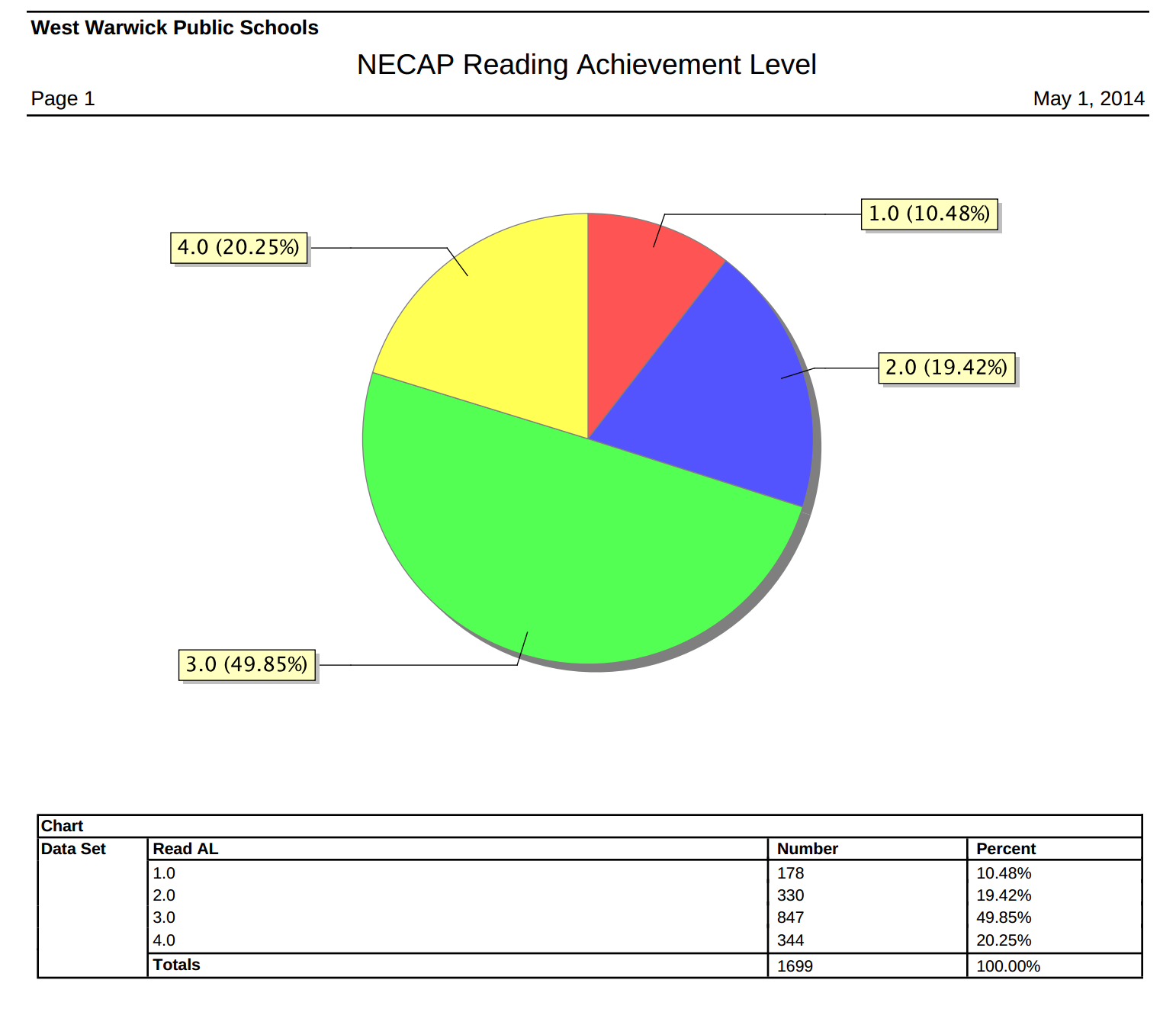 |
| Illustration 3: NECAP Reading Data |
It's a simple tool, but extremely useful. In the next blog post I'll explore how to export data that you've queried, and how to open the data in a Google spreadsheet.


No comments:
Post a Comment